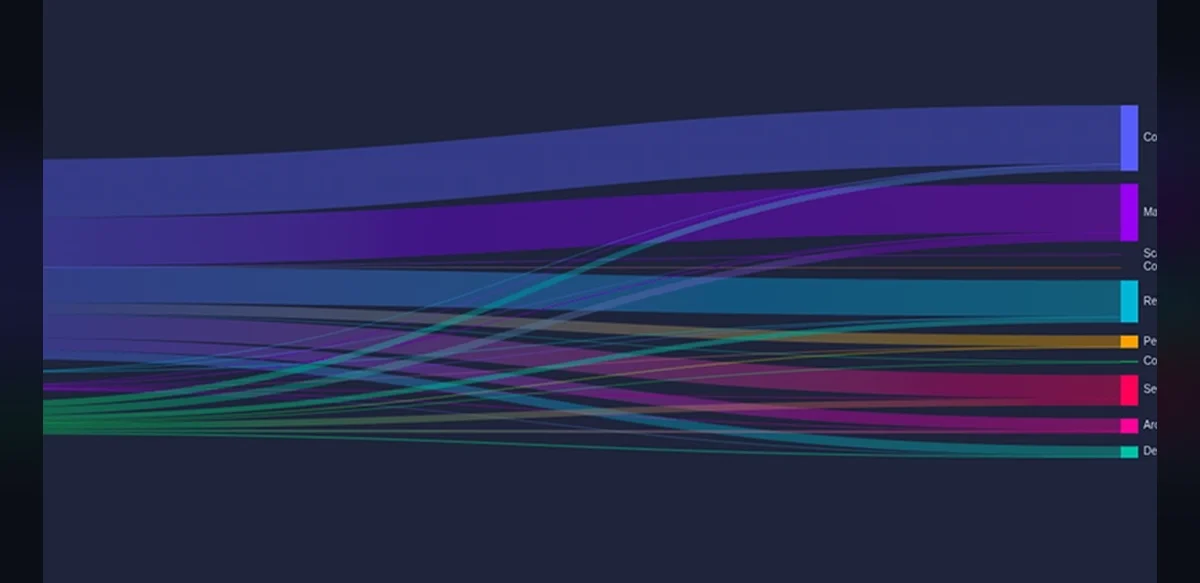
In recent developments within artificial intelligence, researchers have focused on enabling large language models to produce visual representations of data without directly handling pixel-level graphics. This approach emphasizes generating instructions or code that external tools can interpret to create charts. The method begins with the recognition that data itself holds significant value when organized properly. A comprehensive collection of information, such as user feedback or performance metrics, provides the foundation for meaningful analysis.
The process involves training the model to output structured commands compatible with visualization libraries. Instead of attempting to render images internally, the system describes elements like axes, labels, and data series in a textual format. This separation allows for greater flexibility and reduces computational overhead associated with image synthesis. Teams working on such projects often start by curating datasets that include examples of queries paired with corresponding code snippets for chart creation.
One key advantage lies in the interpretability of the output. Generated code can be reviewed and modified by humans before execution, ensuring accuracy and alignment with intended insights. For instance, when dealing with review databases, the model might produce scripts that plot sentiment trends over time or compare categories across multiple sources. This technique avoids common pitfalls of direct image generation, such as inconsistencies in style or scaling issues.
Further refinements include incorporating feedback loops where the model evaluates its own code outputs for errors. Validation steps check for syntax correctness and logical consistency in data mapping. Over iterations, performance improves as the system learns from successful and unsuccessful attempts. Such advancements contribute to broader applications in fields requiring automated reporting and data storytelling.
Challenges remain in handling complex datasets with multiple variables or non-standard formats. Researchers address these by expanding training examples to cover edge cases and diverse chart types including bar graphs, line plots, and scatter diagrams. The emphasis stays on maintaining neutrality in presentation while highlighting key patterns within the information.
Overall, this strategy represents a shift toward hybrid systems that combine language understanding with specialized rendering engines. It opens possibilities for more efficient integration into existing software pipelines where data visualization plays a central role. Continued exploration in this area promises enhanced capabilities for processing and communicating analytical results across various domains.